Beyond the Dashboard: Turning Incentive Program Data into Intelligence

Clean energy and transportation incentive programs generate enormous amounts of data. Every application, rebate, installation, customer interaction and outreach effort adds information about who is participating, where investment is occurring, what technologies are being adopted, how they are being used, and where barriers remain.
At the Center for Sustainable Energy (CSE), we’ve learned more data and more visualizations do not necessarily produce better decisions. The real value comes from knowing which information matters, what it means and how people can use it.
Effective data visualization starts with the people who will use it and the decisions they need to make.
Data does not speak for itself
A chart can show that applications declined last month. It cannot, by itself, explain why.
The decrease might reflect lower customer interest, seasonal buying patterns, a change in incentive levels, reporting delays, limited contractor availability, a new application requirement, or outreach that is failing to reach prospective participants.
The data point is real. Its meaning requires context and interpretation to make data-driven decisions.
Start with the decisions people need to make
The best dashboards are not necessarily the ones with the most metrics. They are the ones that make the right information easy to find and understand.
That requires designing around the user. Who are they? What do they need to know? What decision are they trying to make? What level of detail will help without creating noise?
Answers to those questions affect the ways information is grouped, labeled, mapped and explained.
Strong visualization tools also require collaboration. Program managers, analysts, outreach teams, community partners and agency leaders bring different perspectives on program operations, customers and communities. Bringing those perspectives together helps transform a dashboard from a reporting product into a management tool.
Visualization can improve programs before they launch
Program designers need to understand the markets and communities they intend to serve before the first incentive is issued.
Visual analytics can bring together information that would otherwise sit in disconnected datasets, including technology adoption, household income, housing characteristics, transportation patterns, environmental burdens, utility service territories and existing infrastructure.
Placed on a map or dashboard, those relationships become easier to recognize. Program administrators can see where high need overlaps with low technology adoption, where infrastructure gaps may constrain participation or where different incentive structures may be needed for different customer segments.
Those insights can inform eligibility, incentive amounts, geographic priorities, funding allocations and outreach by providing a clear picture for decision makers to act upon.
Once a program opens, data becomes operational intelligence
A statewide incentive program can involve thousands of applications, multiple technologies, customer types, funding categories and projects across a large geographic area. Managing that complexity through spreadsheets and periodic reports makes it difficult to see problems as they develop.
A dashboard can show how quickly applications are arriving, where funding is being reserved, which projects are advancing and where processing times or cancellation rates are increasing. Instead of discovering a trend during a quarterly review, program teams can see it while there is still time to respond.
Visualization can also create a shared operating picture. Program managers, application processors, analysts, outreach teams and agency partners can work from the same information rather than reconciling separate reports.
For example, CSE developed the California Electric Vehicle Infrastructure Project (CALeVIP) Rebate Statistics dashboard to summarize charger deployment, application progress, and funding distribution across California. This visibility helps teams identify geographic trends, monitor project status, and respond quickly to delays or gaps in charging infrastructure deployment.
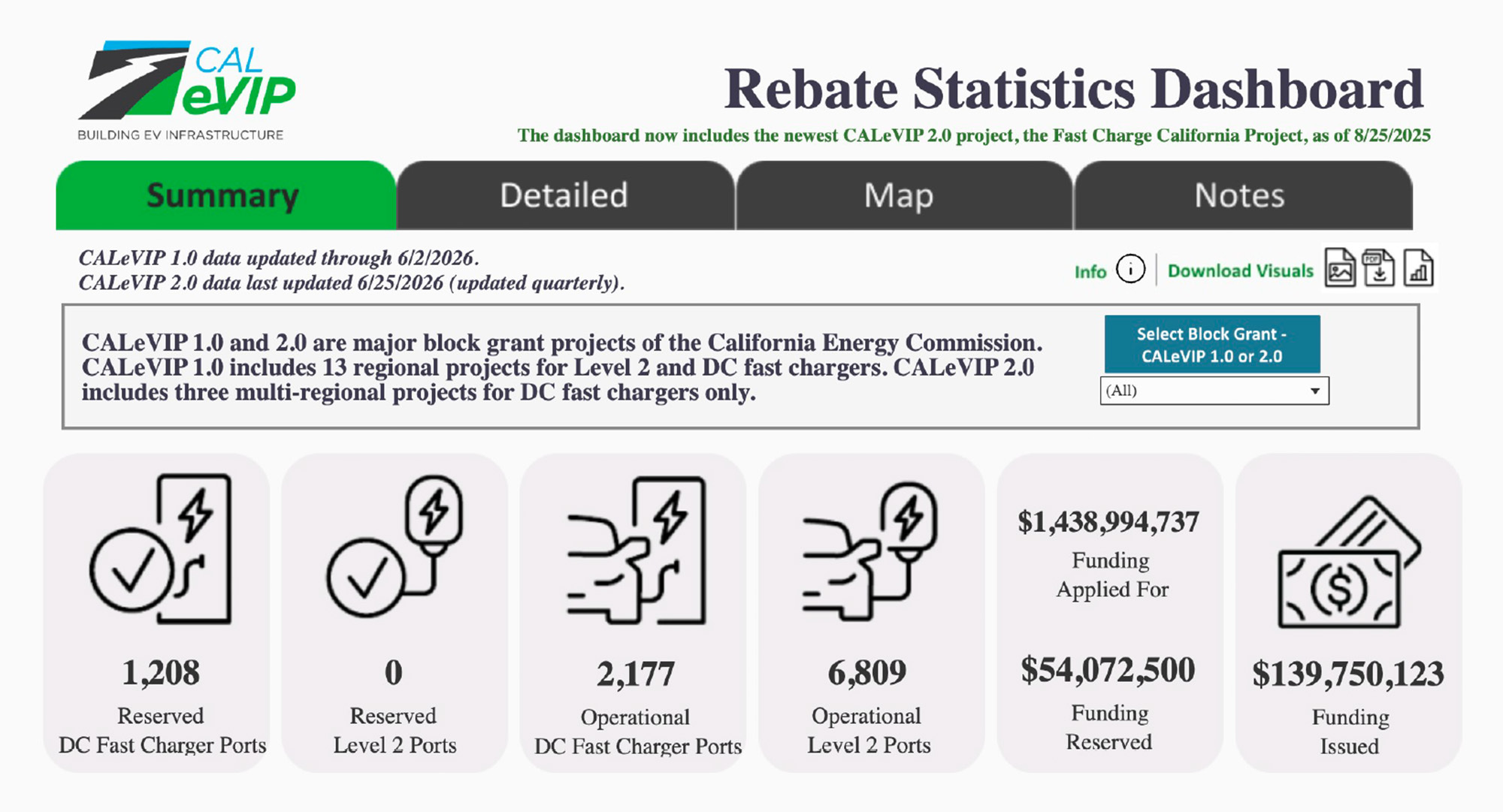
See the full CALeVIP Rebate Statistics dashboard.
Turning program data into market intelligence
Program-wide totals can make performance look strong while masking important differences among communities or target populations. A program may be issuing incentives at the expected pace, for example, while participation remains low in rural areas, multiunit housing, lower-income communities, or neighborhoods carrying disproportionate environmental burdens.
Maps and visual analytics can connect participation with income, geography, housing characteristics and other community conditions. For example, Oregon’s Clean Vehicle Rebate Project statistics dashboard incorporates survey data to provide context about participants, helping the team look beyond participation rates to investigate why some consumers may be participating at different rates than others. This kind of market intelligence can reveal who the program is reaching, who it may be missing, and where outreach, partnerships or other program strategies may need to be adjusted.
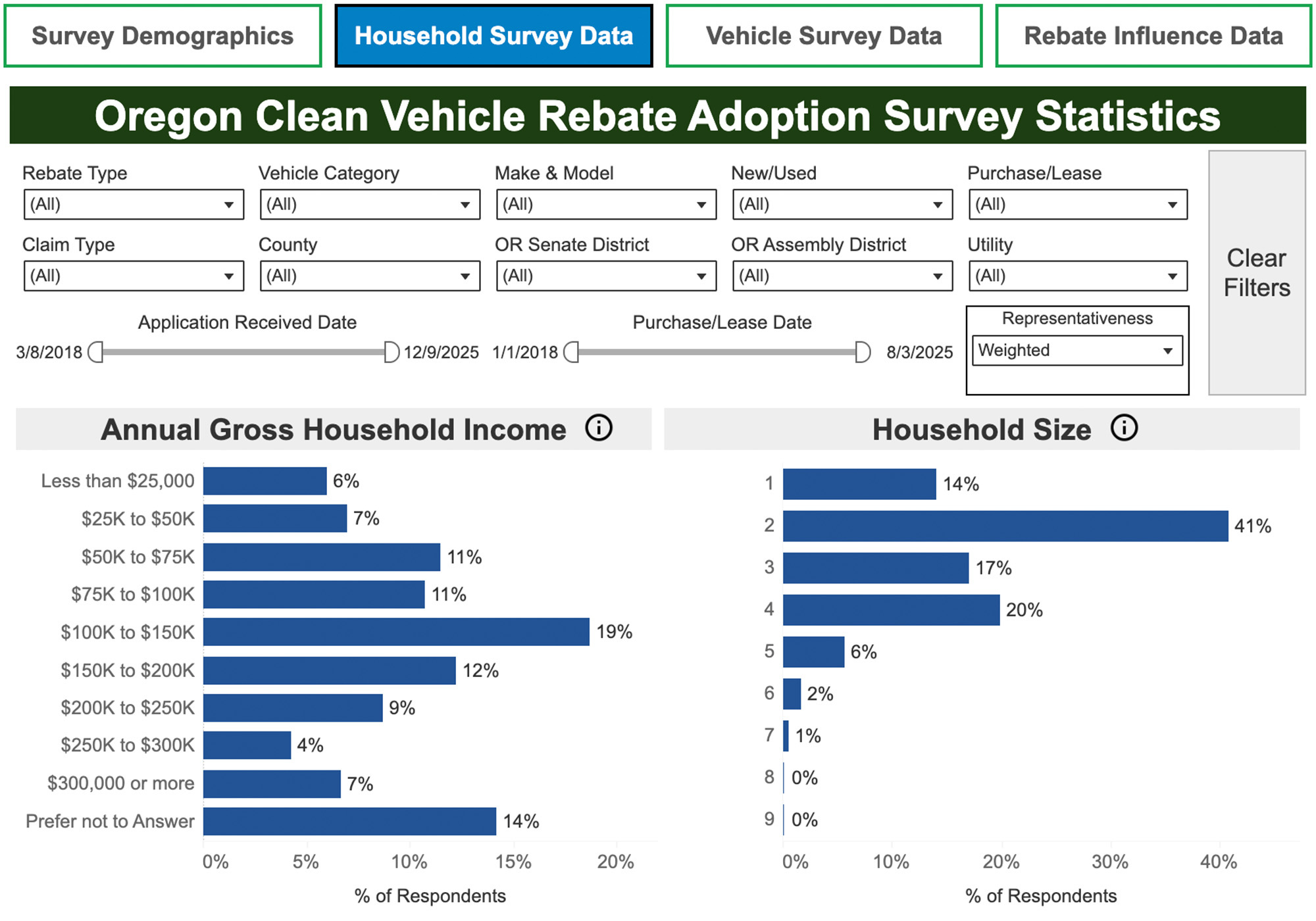
See the full Oregon CVRP Rebate Statistics dashboard.
Program data can also reveal changes in the broader market, showing over time which technologies customers are choosing, where demand is growing and where projects face recurring barriers or infrastructure gaps. These insights can inform funding priorities, utility planning, program design and private-sector investment.
For example, CALeVIP prioritizes projects in disadvantaged and low-income communities and tribal areas. CSE’s EV Charging Opportunity Finder helps prospective applicants identify where these communities overlap with areas likely to see greater charger use. By combining data on EV registrations, existing charging infrastructure and utility service areas, the tool helps applicants identify locations that could support both high charger utilization and equitable deployment.
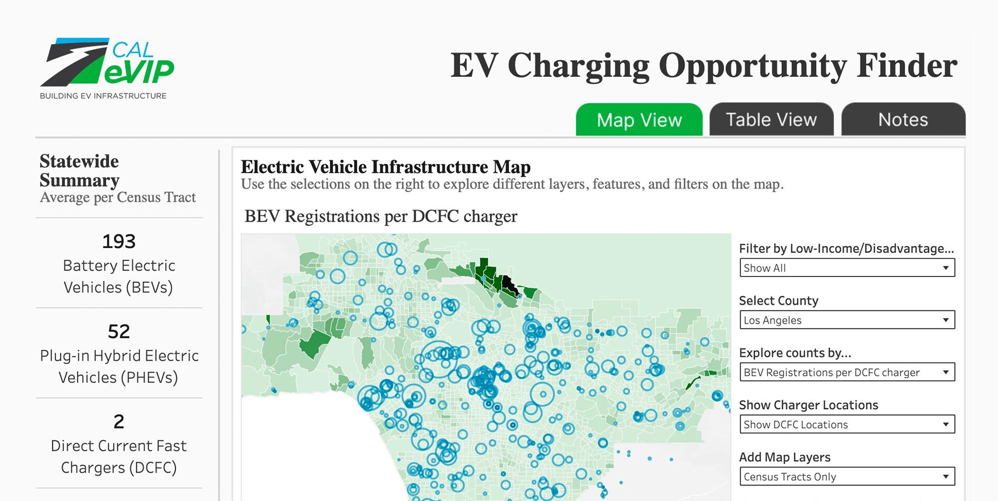
See the EV Charging Opportunity Finder.
Visualization strengthens accountability
Data visualization can help governments and utilities show stakeholders how public funds are being used and what they are achieving. Interactive maps, dashboards and visual summaries can show where incentives are distributed, how participation is changing and whether a program is progressing toward its goals.
Making that information accessible and understandable strengthens transparency and accountability for public investment.
For example, CSE combined data from five different transportation programs in the California ZEV Insights dashboard for the California Air Resources Board to track how incentives are being distributed, including incentive volumes and funding allocations, the types of EVs being incentivized, and the characteristics of participants. Stakeholders can see which programs are having the greatest impact, which populations and areas are being served, and where there are gaps in program support.
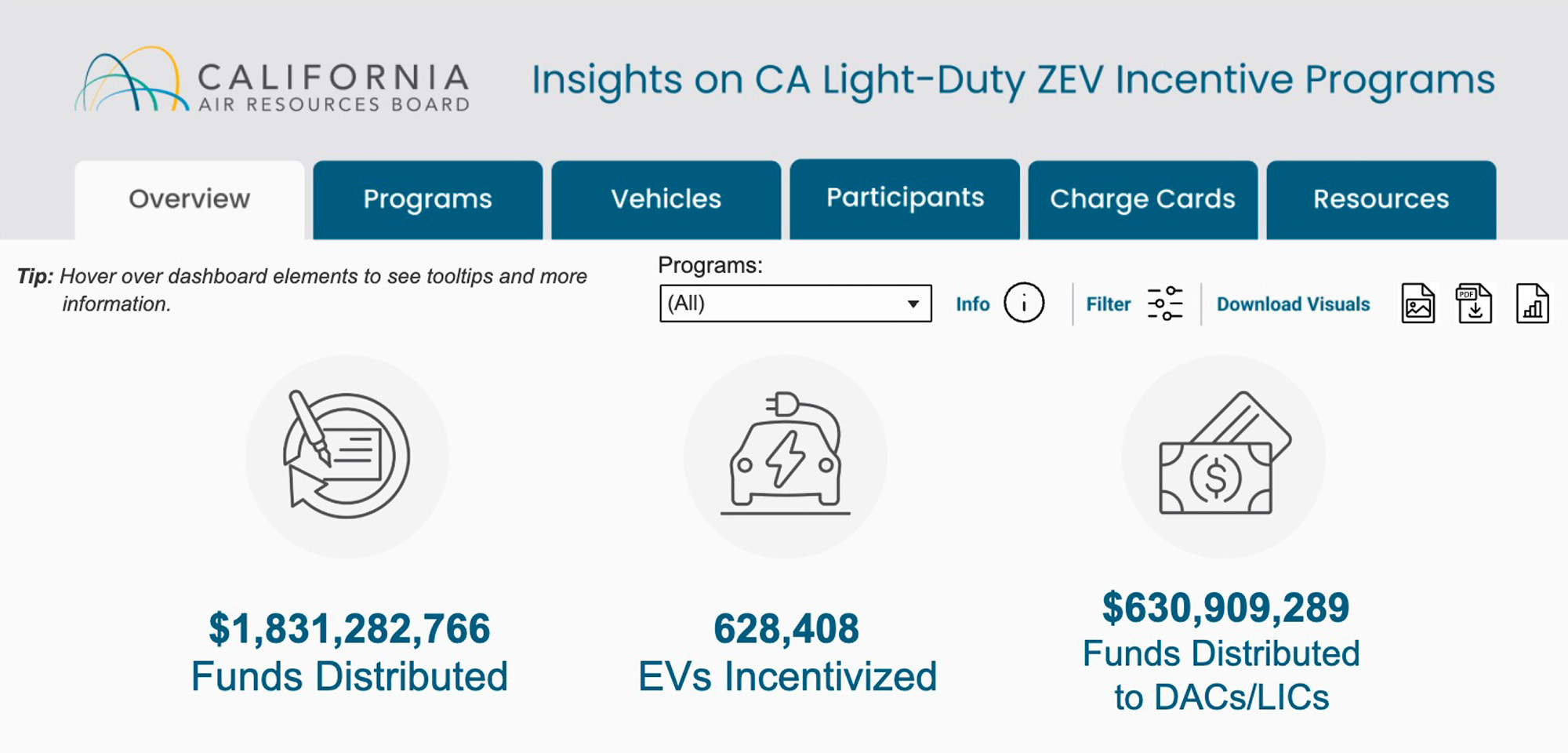
See the California ZEV Insights dashboard.
From reporting to action
Data visualization is most valuable when it leads to action.
- Program design shapes what data is collected.
- Implementation generates new information.
- Visualization makes patterns easier to see.
- Data-driven interpretation helps turn those patterns into insights that can improve outreach, operations, funding decisions and future program design.
That cycle is important as investment in electric vehicles, EV charging, solar, energy storage and building electrification grows. Program data can do more than document where public funds went. Used well, it can help administrators better understand markets and communities, identify barriers and improve results.
The most important question is not “What does the dashboard show?” It is “What should we do next?”

Crista Gregg
Visual Analytics Specialist
Crista has eight years of experience in data visualization, statistical analysis, and Tableau and Power BI dashboard development. At CSE, she designs and maintains dashboards for clean energy and transportation programs, translating program data into accessible insights for stakeholders. Previously…
Read more by Crista Gregg